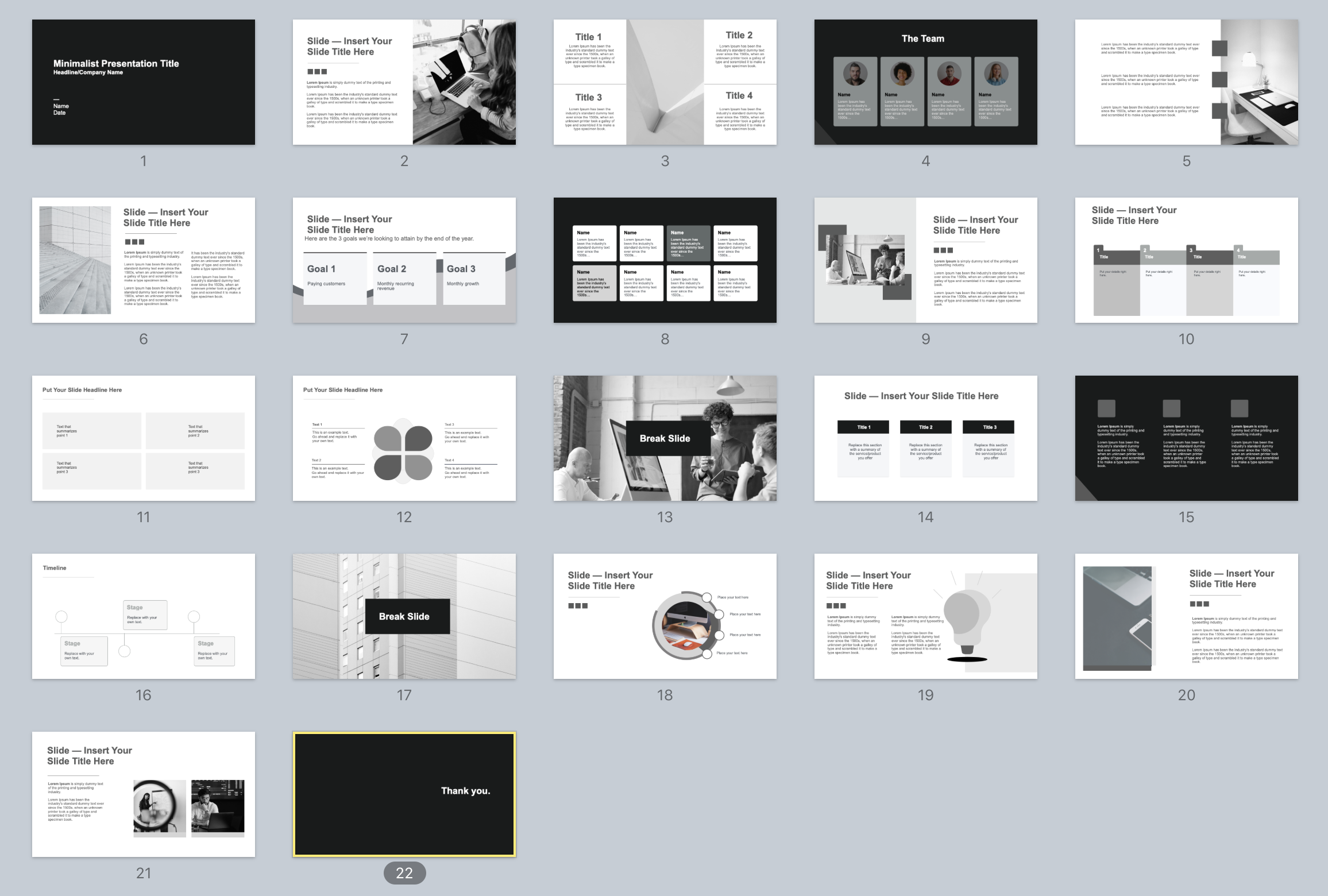
 In today’s post, you’re going to get a clean, minimalist template with 22 unique, fully editable slides.
Use them to present information clearly and concisely for any type of professional presentation.
Let’s dive in…
But wait, what is a minimalist presentation template exactly?
This template will be useful to you only if you know what you can use it for in the first place.So here’s a quick summary:
Minimalist templates can help you craft presentations that focus on simplicity and clarity, with minimal visual elements.
It basically involves removing unnecessary distractions and keeping the content streamlined to optimize your audience engagement and understanding.
In a minimalist presentation, the design elements, such as text, images, and colors, are deliberately kept minimalistic. The goal is to convey information in a visually appealing and efficient manner, without overwhelming the audience with excessive details or cluttered slides (which is still the case of most presentations).

5 simple principles to help you create minimalist slides
1. Clean and uncluttered design. Use ample white space, simple backgrounds, and limited visual elements to create a clean and focused look.
2. Minimal text. Keep text to a minimum by using short and concise phrases, bullet points, or keywords. Avoid lengthy paragraphs or sentences (you can use the free tool Hemingway to ensure your text is easy to understand).
3. Visual emphasis. Use impactful, high quality visuals like images, charts, or diagrams, to enhance understanding and engage the audience. Also make sure to leverage white space strategically so you can separate elements, improve readability, and create a sense of balance.
4. Consistent and readable typography. Choose a simple and legible font type, size, and color scheme to ensure easy reading across different devices and screen sizes (oh, and stick to it).
5. Limited color palette. Stick to a small number of complementary colors to maintain visual coherence and avoid distractions. 3 is a good number to stick with.
The minimalist presentation template
Download it
Here are the links to access the template:- PowerPoint version
- Keynote version
- Google Slides version (click file -> “make a copy” to create and edit your own version)
Conclusion
Use this minimalist presentation in various contexts, such as business meetings, educational settings, or conference presentations. And remember: simplify the visual elements to help your audience grasp the content more easily.
If you want to make stellar presentations in a fraction of the time it usually takes, read this
I’ve created PPTPACK, a premium presentation template kit for business professionals, students, and founders looking for one thing:Create clean and modern slides that get their message across and make an amazing impression. In a fraction of the time it normally takes.
The presentation kit includes fully editable slides, graphics, and illustrations that work in the real world. If this sound like something that could help you, you can check out the template right here.


