 Raise your hand if you’ve ever felt like:
“I want to make beautiful, attention-grabbing slides, but I’m not a designer, and I don’t have time”.
In today’s post, you’ll get your hands on a fully editable professional presentation template to help you design slides like a pro, impress your audience, and get your message across.
Before jumping in, I want to get started with two super important principles (don’t skip these).
1. Don’t Use Built-in Microsoft Templates
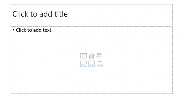
Look, Microsoft PowerPoint templates have been around for a while. They’ve been used, re-used, and actually, over-used. And the truth is, they don’t look very nice.
So, do yourself a favor:
Don’t use built-in templates any more.
First, like I said, because every one uses them, they’re incredibly boring.
Second, they make you look like a lazy person who didn’t put much work in designing his presentation (”Oh, THAT template again….”)
2. Don’t Use Pre-Set Text Boxes
If you want to add text on your slide, create your own text boxes (insert > text box)….instead of using PowerPoint pre-set text boxes.
You’ll have the freedom to integrate them wherever you want on your PPT slide and chose the text size you want (text size won’t adjust automatically, so you’ll have more control).
That’s getting one step closer to designing professional presentations that work for you.
Now, let’s move on to the meat of this post.
The Template You Need to Your Own Professional PowerPoint Templates
I’ve been using the same template over years.
Literally.
The truth is, it’s a whole lot quicker to grab a professional slick, standard template to work with.
And apply a few changes (like modifying the layout, colors and elements) depending on the type of presentation you gotta do.
But the rest is basically the same.
This template allows me to save a huge amount of time.
So whether you’re in marketing, engineering or private equity, this template will help you design a professional PowerPoint presentations FAST.
First things first, let’s check out how this all works step by step.
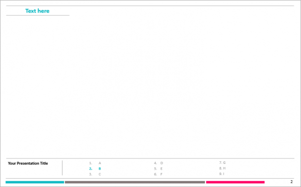
How it looks like:
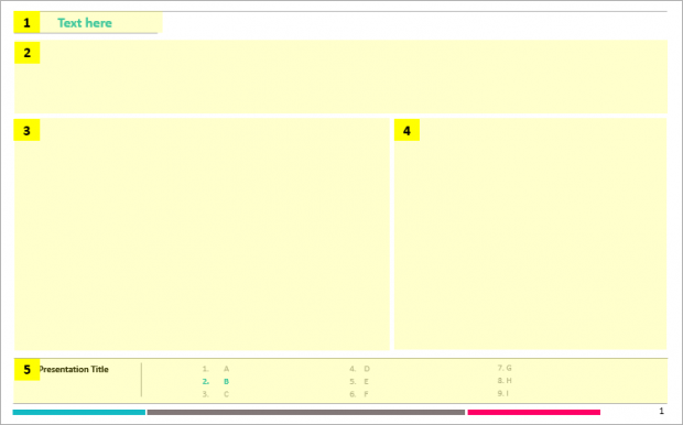
Now, we’re going to dissect that template so you can understand clearly where things (AKA your content) are supposed to go:
1. The Presentation Section
You want to put the name of the section you’re covering in this area.
The point of this information is to guide your reader/viewer in the presentation, and basically let him know what the slide is going to be about.
For instance, let’s say you’re making a presentation about your Q3 sales results.
The slide section description could be ‘Sales results summary”.
Making a sales presentation and the next slides are about your services?
Boom… Slide section: “Our services”
2. An Attention-Grabbing Headline
Your headline has two targets:
Grab the attention of your audience
Motivate them to keep reading
Now, powerful headlines have four qualities:
1) Self-interest (focused on your audience) -> How ABC company helps you drive more sales
2) News (teach them something) -> Q3 results decreased by 13% for three reasons
3) Curiosity (get them want to know more) -> The simple process that will help you become a better speaker
4) Ultra-specific (use figures) -> Use these 3 techniques to grow your website traffic by 50% in 90 days
So I recommend you to use the headline space to wrap up the content of your slide.
Imagine someone’s really busy and doesn’t have the time to go through all the details…. Could you give him a hint about what it’s going to be about, or even better, tell him what’s the takeaway of this slide?
Your job as a presenter is to make the life of your audience easier.
3. Your Body Copy
Or, as I like to call it, ‘the meat”.
The point of this part is to dive into the content of your slide.
For example:
Headline -> How ABC company helps you drive more sales
Body copy -> You could be listing the 3 core services you offer to prospective customers that help them get more sales
4. Illustrations
Illustrations are any visual that will help you highlight the core message of your slide.
A beautiful photography
A data chart
Tables
(👉 Side note: if you’re interested in learning simple tricks to make beautiful data tables on your slides, check out this post).
The one rule you need to follow?
You can only add an illustration if it helps getting your point across.
How to Design a Gorgeous, Professional Looking Presentation Without Having to Spend Your Whole Weekend on It…
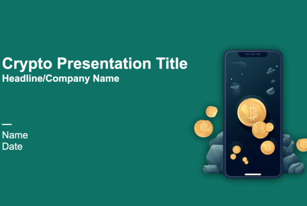
When you’re having high-stake meetings all year long, being able to quickly crank out quality presentations without learning Photoshop or hiring an expensive designer is a must.
Premium presentation templates help people of all talent ranges to create fantastic presentations fast.
Don’t take my word for it, judge by yourself instead:
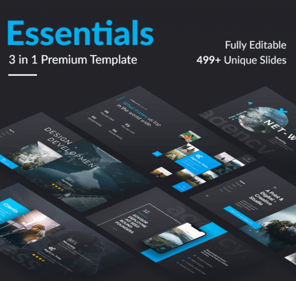
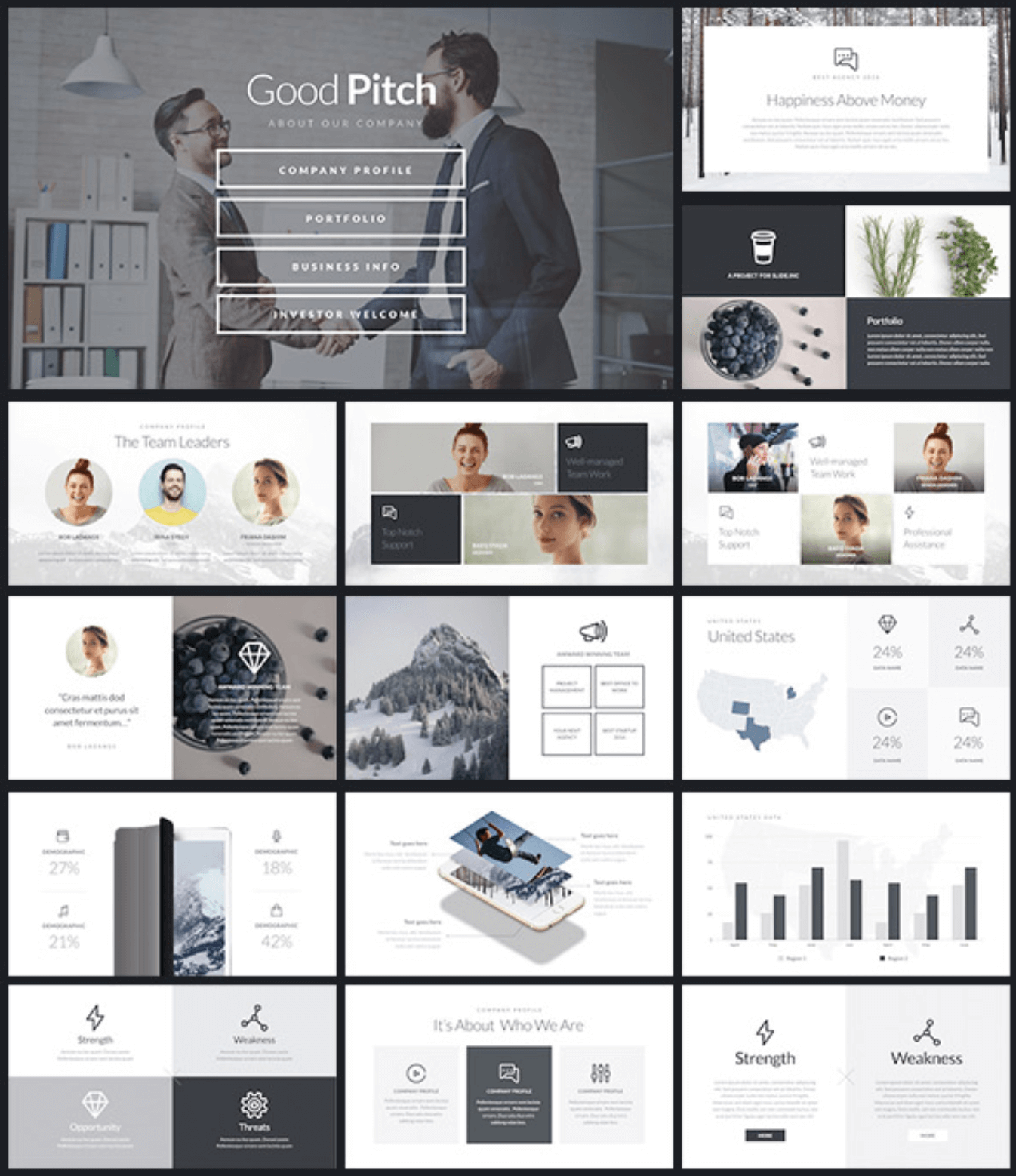
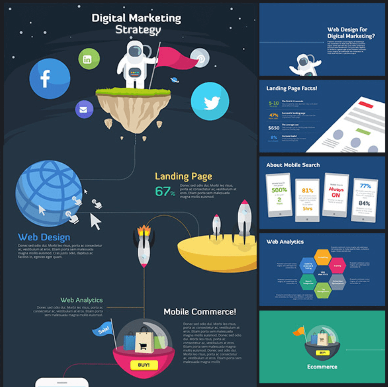
Presentation templates help you save time, make impressive presentations and look like a real pro, fast.
They all include:
👉 Unique, ready-to-be-edited slides. Made by professional designers.
👉 Vector-based elements. Most of the shapes and icons included in the templates are editable. That means you can modify all the shapes, sizes and colors without losing image quality.
👉 Drag-and-drop placeholders. You can insert any picture into a placeholder (a shape that’s already included in the slide).
👉 Fully-editable illustrations (change colors and sizes without losing quality)
And so much more!
And you can get them for the price of a movie ticket (yes, really).
If that sounds interesting to you, check out the links below to learn more:
🤟 Affiliate disclosure. PPTPOP is a participant in the Envato Affiliate Program, and we get a commission on purchases made through our links (it doesn’t cost you anything).

