 This guide will teach you everything you need to know about making creative presentations that impress and get your message across, every single time.
It includes 41 practical techniques, strategies, and ideas that you can use on your presentations today.
Let’s dive in…
Creative Presentation Techniques, Tips & Ideas
Here’s a table containing the different categories in which the strategies you’re about to learn fall into.
Feel free to jump to a specific section:
I’ll talk about the following slide design tips and techniques in this post (you can also click on every single link to be taken straight to the tip):
1. Get started with this 2-step hack
2. Create your own color palette
3. Apply grid systems
4. Use the CRAP principle
5. Customize the size of your slides
6. Use high-quality visuals (get ’em here)
7. Pick easy to read fonts
8. Use this 3-step hack to design your cover
9. Add shapes to display your text
10. Integrate semi-transparent shapes
11. Add colorful circles on top of visuals
12. Get to the f*king point
13. Use bold, italics and underlining
14. Change the color of your text
15. Add headlines to wrap up your content
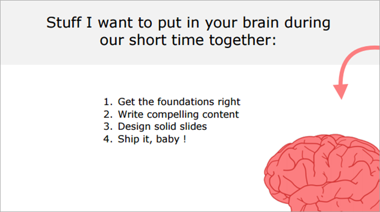
16. Apply the “Brain Dump” technique
17. Paint a picture in your reader’s mind
18. Hit their emotions (here’s how)
19. Use the 30% rule for headlines
20. Add an horizontal bar below headlines
21. Integrate the headline inside a shape
22. Create custom-made illustrations
23. Customize this template for business slides
24. Integrate icons to get your point across
25. Add one piece of text per line
26. Use a different font
27. Use shapes to create custom charts
28. Use editable, colorful shapes for your text
29. Integrate flags to highlight your text
30. Ask questions to increase engagement
31. Do this if you need a slide about yourself
32. Play with rotation to create dynamism
33. Take advantage of white space
34. Add shadows to your visuals
35. Integrate text effects
36. Add memes
37. Use emojis
38. End with a strong closing slide
39. Steal like an artist
40. Reverse engineer the best
41. Invest in premium templates
The 7 Foundations Behind Great Presentations (With Resources)
1. Start With This 2-Step Technique
First, start a presentation with defining why you’re doing it:“I’m doing this presentation to <goal>”
For instance:
“I’m doing this presentation to <teach SEO techniques to restaurant owners>.
Applying this simple strategy will force you to focus on your key objective when building the presentation. Because what you’ll be doing every time you want to add something in your deck, you’ll ask yourself…”does that help me get closer to my goal or not?”.
Then, build up your core message (AKA the #1 thing you want your audience to remember).
That step is super important because every piece of information you’ll be putting inside your presentation deck will be angled toward supporting that one message. Use this formula to build it:
Action verb + [ targeted audience ] + [ result wanted ]
For example:
Show these Shanghai-based insurance companies how my agency can help them get more leads.
Convince my boss to increase the operating budget next year.
2. Make Your Own Color Theme
Color accounts for 85% of the reason why someone decides to purchase a product.
So yes, creating a clear, consistent color theme for your presentation is important. Now, you can check out the guideline below to asses which colors are likely to fit the best with your presentation:
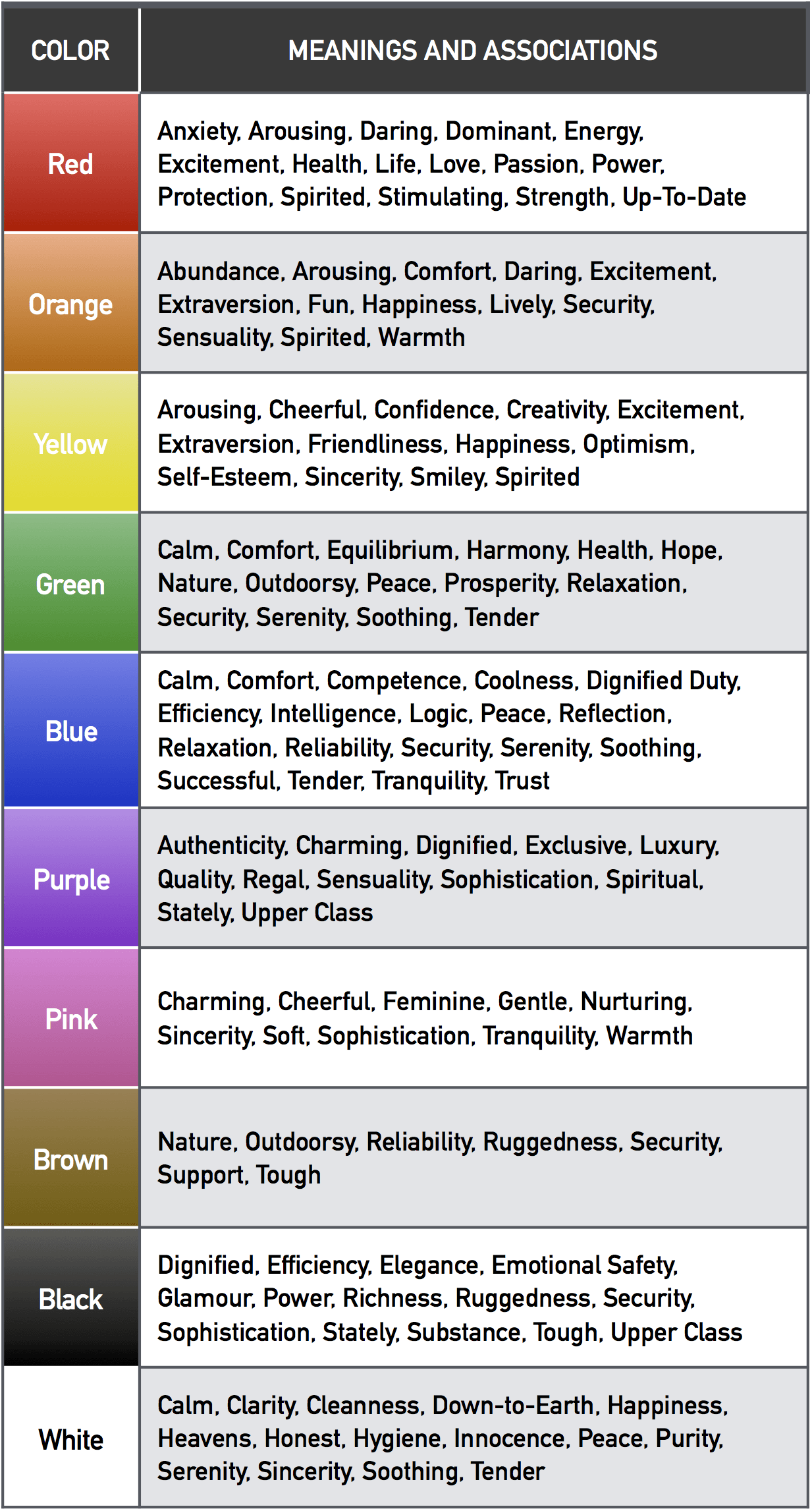
Source
To create the perfect palette, head over to Kuler, or Color Supply color wheel tools. I advise that you get started with the “triad” color rule, and select up to three colors for your presentation.
To assess if you’ve done a good job at applying your palette, just zoom out of your presentation and check if you can clearly identify the colors you wanted to highlight. If you’re not sure, ask a friend or a colleague to identify the main colors.
The example below shows you a presentation that uses 3 easily identifiable colors:
3. Apply a Grid System
To design professional slides, you need to have some structure.
I’ll explain:
Designer Sam Hampton-Smith likes to say that grids are the invisible glue that holds a design together. Here are proven grid models you can use to organize your slides:
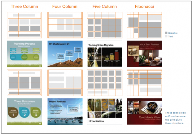
Grids help you position text and visuals more precisely because they’re providing a invisible spine to which they can align. So use a grid-based approach when designing your slides in order to make your content look clean and tidy.
Here’s an example below:
Here’s the grid model I used to come up with this well designed slide:
4. Use the CRAP Principle
CRAP stands for Contrast, Repetition, Alignment, Proximity.
If you’re new to creative presentation and, more globally, graphic design, CRAP are by far the 4 most important guidelines you need to remember when building your slides. Now, take a look at the definitions and example slide below:
Contrast is about making things stand out through manipulation of space (near / far, empty / filled), color choices (dark vs. light / cool vs. warm) and text (typography style / bold vs. narrow).

Repetition, for instance making a headline and a sub-message the same color, makes scanning your deck much easier.
Repetition helps you create a cohesive look to your presentation.
Newspapers use this to great effect. Aligning a whole bunch of elements with one another makes them scan faster.
Alignment makes things easier to read.
![]()
Proximity means that things are associated with one another:
The closer things are, the more they are associated. The farther they are away from one another, the less they are associated.

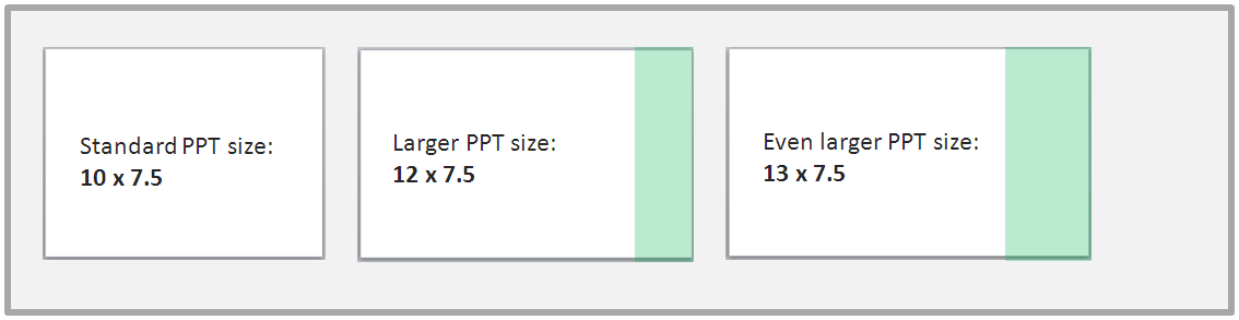
5. Customize the Size of Your Presentation Slides
Standard slides are usually sized 10 inches (width) * 7.5 inches (height). Re-size yours 12*7.5 (Open a PowerPoint document, go to Design > Page Setup):
The idea here is to have more horizontal space, meaning more freedom (and creativity) to design your slides.
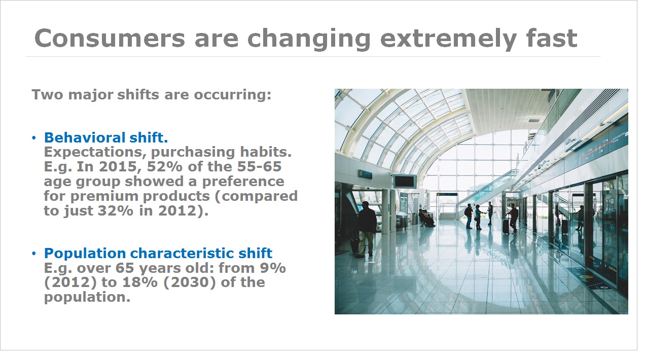
6. Embed High Quality Visuals
We process visuals 60,000 times faster than text so yes, you’d better use image over text whenever possible. But you already know that, don’t you? Instead of just telling you to use visuals, I’ll list down below my favorite free-to-use resources:
Pexels (lots of options, I love it)
Gratisography (crisp, fun)
Startup stock photos (genuine-looking)
Pexels (lots of themes, love it)
Unsplash (nature related)
Little visuals (like Unsplash)
Pic jumbo (urban-related mostly)
7. Chose Easy to Read Fonts
People are more likely to engage in a given behavior the less effort it requires (Source).
In other words, make sure to pick a font that’s easy to read at a distance. That means your text size should be big enough to be legible to the person seating the farthest from your location.
Pick a standard, modern Sans Serif font for your core text (such as Helvetica, Calibri or Verdana). A good way to get started pairing fonts is to integrate a creative font to a specific part of the text you’d like your audience to focus on. Mostly on transition and cover slides.
Here’s an example:

For free and creative font options, check out:
Tip: To install new fonts on Window, download the archive > click Start > Control Panel > Font > Paste your font files.
Creative Slide Design Techniques to Enhance Your Message
8. Use This Hack to Design Your Cover Slide
Your title slide should instantly grab the attention of your audience and convey key information about the topic you will cover.
A great way to design gorgeous cover slides fast is to follow this simple, 3-step process:
1) Find an awesome visual related to your presentation topic
2) Add a rectangle shape on top of that visual, apply gradient fill, customize the two colors, and make it half-transparent. Check out the quick instructions below:
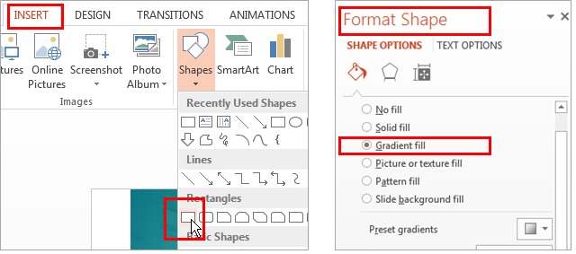
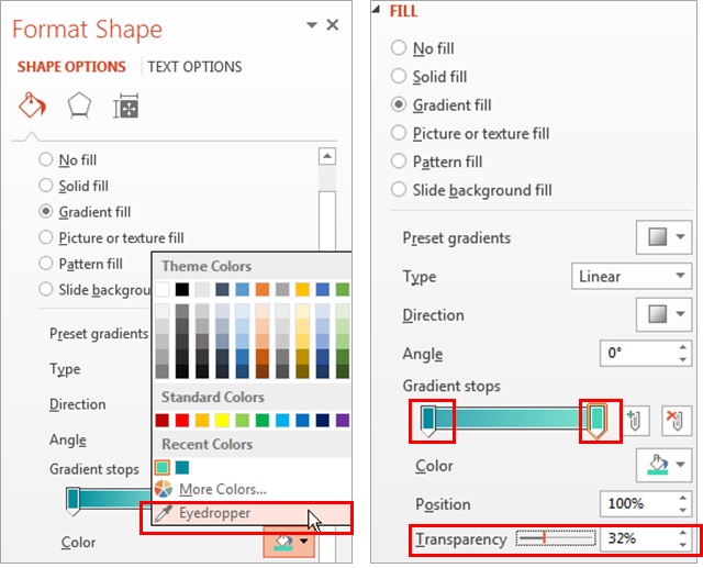
Note: you can use the eyedropper to “copy” the color from any visual you’d like.
3) Integrate your text
Here’s an example of a pitch deck slide I designed in less than 3 minutes – following this exact process:

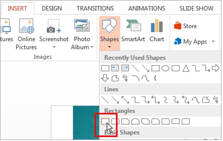
9. Add Shapes to Display Your Text
Adding text shapes on top of backgrounds allows your audience to pause a second and take the time to absorb the information you’ve communicated to them so far.
Now, a good rule is to pick a plain color that contrasts clearly with the visual in the background. If the background is a plain color, you’ll also make sure both text and shape colors allow the reader to go through comfortably (pick the perfect matching colors on Kuler or Color Supply).
Here’s a great example from Blue Lobster:

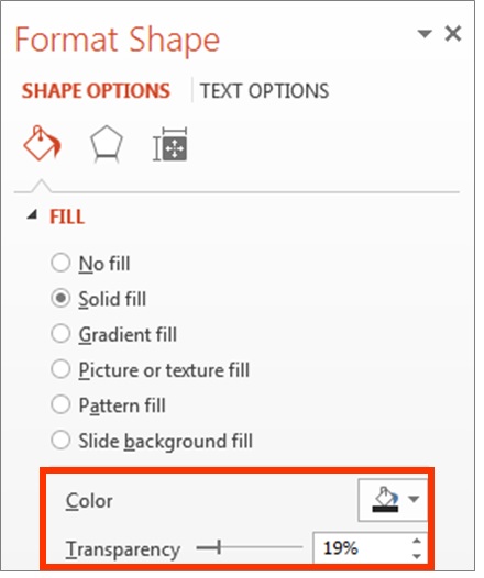
10. Integrate Semi-Transparent Shapes
Add semi-transparent rectangular shapes on top of great visuals to display your headline. You can apply this simple technique to both cover and transitions slides for maximum effect.

Transparency allows people to see the whole visual behind your text. Use this technique with care, and don’t forget that your first priority is to make sure your slide text is easy to read.
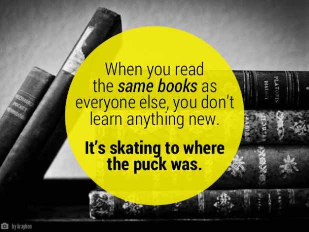
11. Add Colorful Circles on Top of Visuals
This allows you to display your text in an aesthetic way that draws the attention. Make sure that your text is centered in order to create repetition and be consistent with the rounded shape of the circle.
You can use this technique in the introduction of your presentation, or in your title slide.
For instance, if you’re making a sales deck, you could address the problem your prospective client is facing (e.g. “How many clients are you losing every day because of your copy?”).
Ryan Holiday made a presentation about “24 Books You’ve Never Heard Of – But Will Change Your Life“. In the example below, he starts off his deck addressing the problem many people are facing when reading books.

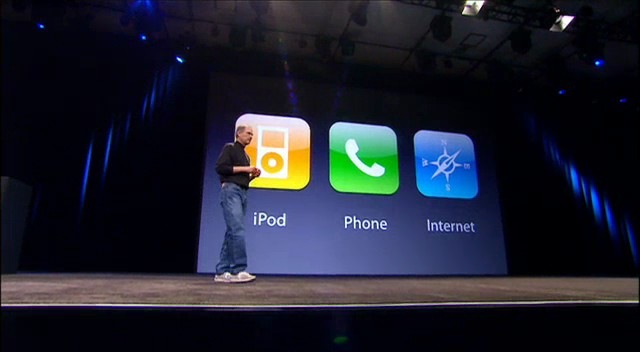
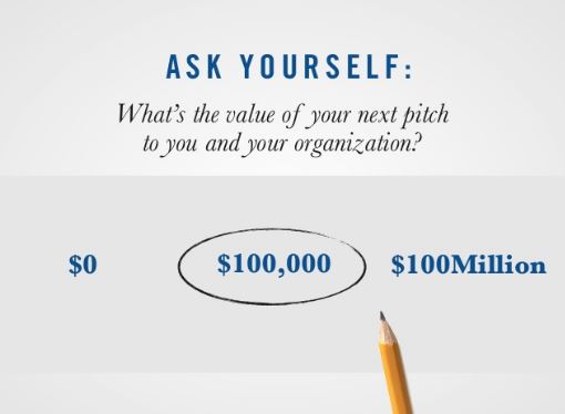
12. Get to the F*king Point
Here’s the deal:
One slide = one idea, one message, one core point.
So every time you’re making a slide, say out loud the following sentence:
The purpose of this slide is to [ ____ ]
For example:
The purpose of this slide is to [ show that our sales grew by 16% this year ]
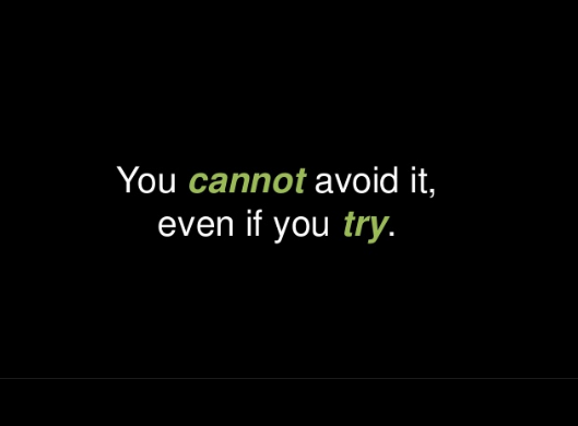
13. Use Bold, Italics and Underlining to Draw Attention
Using different font sizes is an effective way to create hierarchy between primary and secondary text, but it’s not the only one. See, you can also play with bolds or italics in order to draw the attention of your audience to a specific keyword or sentence.
This technique is another way to get your message across more effectively.
14. Change the Color of Your Text
Now, in line with tip #14, you can also highlight a specific part of your text changing its color. It will help your reader almost automatically understand what’s important, and create dynamism on your slide.
Slide Headlines: Copywriting Tips & Design Layouts
15. Wrap Up Your Slide’s Content with Headlines
Use headlines that resume the content of your slide in a short and concise way. See, headlines are pieces of text aiming to grab the attention of your audience, and motivate them keep to keep on reading.
And the truth is, people are busy and most of them are going to skim through your presentation rapidly, without taking a look at all the details you’ll be providing them. Your job as a presenter is to make their life easier.
To put it differently, I want you to think:
If someone could only read my slide’s headline, what would I want him to remember?
(“Here’s what I want them to think: “I got it, this slide is about the content of the presentation”).
16. Apply The “Brain Dump” Technique to Write Headlines
That technique helps a lot, especially if you’re working on a sales presentation and need to craft the perfect message for your prospect.
So what you’re gonna do is create a couple of variations for your headlines. You could do this on your own, or grab a few colleagues and ask them for their ideas or feedbacks.
The point here is to get several “shots”, and then pick the best one.
Let’s take a look at a concrete example (focused on the weight-loss problem):
Subject 1: How to lose weight (super sucky)
Subject 2: How to lose weight effectively (meh)
Subject 3: 5 best-ever weight-loss secrets from thin people (good)
Subject 4: 3 things experts won’t tell you about weight-loss (super catchy)
17. Paint a Picture in Your Reader’s Mind
If I asked you right now, “What makes your company different?”… what would you say?To make what you’re writing more vivid (and paint a mental picture in the mind of your audience), you have two big options:
1) Be more specific (write ““How to cut your expenses by 25% in the next 30 days” instead of “How to improve your finance quickly”)
2) Add vivid details people can PAINT in their mind (“I walked in from work, and my kid run up to me with his book saying….”)

18. Hit Their Emotions (Here’s How)
This is very important if you’re telling a story, or trying to sell your product/service to potential customer. Because you want your audience to feel something.At every paragraph.
Anger, curiosity, pain, relief, joy.
19. Use the 30% Rule For Headlines
A good rule of thumb is to allocate approximately 30% of your slide’s real estate to your headline.Of course, if you’re making a corporate presentation that includes more text, 20% works perfectly fine. Using the 30% rule forces you to allocate enough space for the part that matters the most: wrapping up the major takeaway of your slide in one catchy headline (more on how to do that here).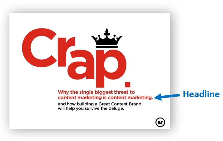
20. Add an Horizontal Bar Below Your Headline
Add an horizontal bar to create contrast between your headline and the body text, making it easier for your audience to read through the slide.
21. Integrate Your Headline Inside a Shape
This will also help create contrast between your headline and the body text.Here’s a great example from Kissmetrics:
22. Create Custom-Made Drawings & Illustrations
A good creative way to build unique, well designed PowerPoint slides is to integrate drawings.You can create them on Paint or on Sketchup using an iPad pencil. Otherwise can consider hiring a freelancer for as little as $5 on Fiverr. This isn’t a presentation but the homepage of Wealthfront financial management services:

You could apply this same illustration strategy on your presentation.
Simple Slide Design Ideas For Unique Presentations
23. Customize This Template to Make Your Business Slides
Want a professional slide layout design that’ll help you save time for your next presentation?Click the image below, check out the post, and download the template for free. Apply it to your deck and you’ll be able to build up good-looking, professional presentation slides fast.
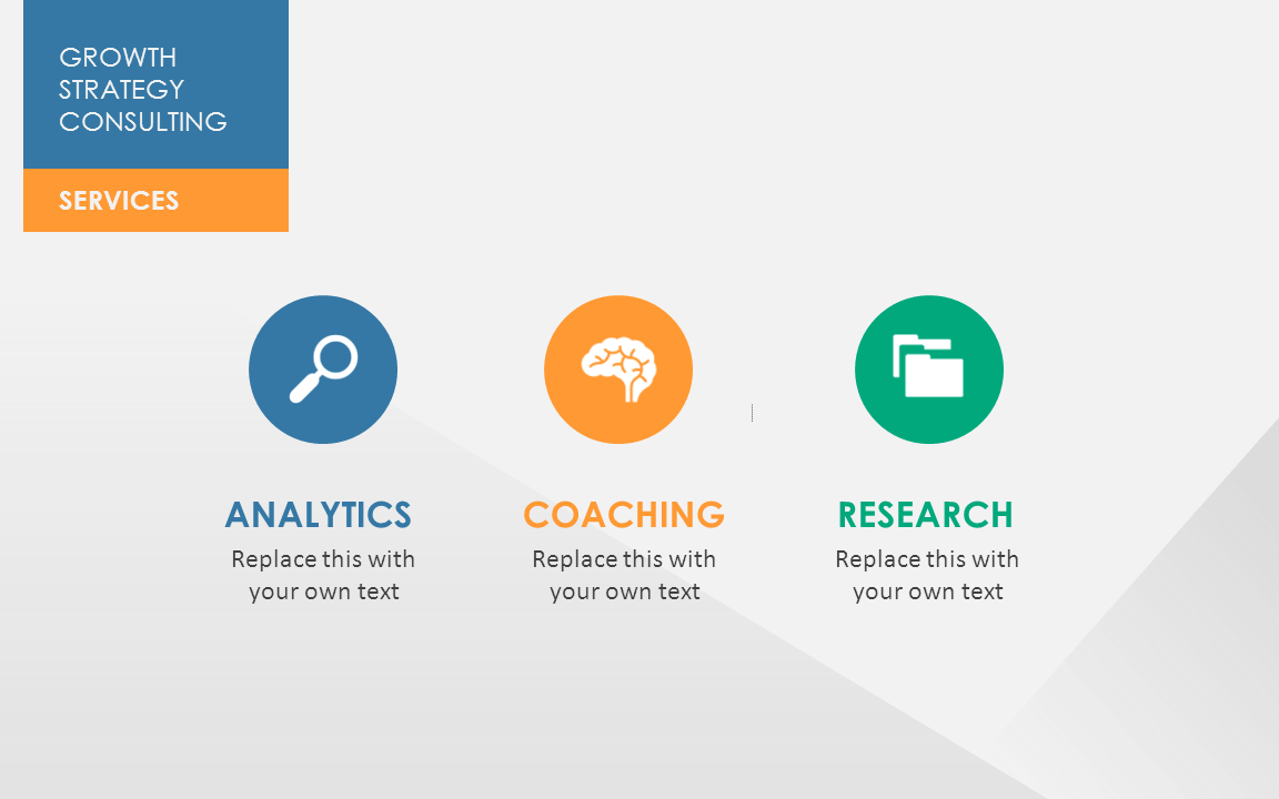
24. Integrate Icons to Get Your Point Across
Icons are a great way to present information. And the good news is, they are a ton of sites offering free icons for you to use. Here are my favorites:
I recommend you to grab PNG file format, because they usually have transparent image backgrounds.
What you can do here is create circle shapes and add your chosen icons in the center of each circle. If your circles have a light color, use black/dark icons. If they have a darker color, use white icons.
This technique works pretty well when applying the repetition principle.
25. Add One Piece of Text Per Line
This simple technique works great for cover and transition slides.Because it allows you to create space and facilitate comprehension among readers, while taking full advantage of your slide’s space:

26. Use a Different Font For Keywords That Matter the Most
This tip allows you to naturally emphasize on a word you want to highlight. Changing the font of this specific word automatically creates a contrast that makes it stand out from the rest.
Click here if you want to learn how to actually pitch an idea
27. Use Shapes to Create Charts
If the graph data from your graph is simple enough, create your own, simple graphics using rectangle shapes. Check this out: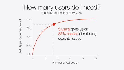
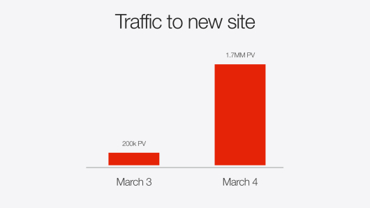
Which one sounds more effective to you?
28. Use Editable Shapes to Highlight Your Text
Another great way to create dynamism in your presentation is to highlight a part of your text.
Check out concrete examples and download your editable shapes for free right here.

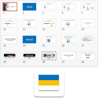
29. Integrate Color Flags to Highlight Your Text
Adding flag shapes that contrast with the background of your slide is another creative way you can use to display your message.
30. Ask Questions to Boost Engagement
Asking questions helps you to create conversation with your reader.Using the words “you” helps your audience relate with what you’re telling them. Taking a conversational tone in your deck is a great way to make your audience feel engaged.
31. Do This if You Need a Slide About Yourself
Who said creating slides to present your team (or yourself) was hard?
This solid example below shows you how simple it can be to create good looking slides to talk about yourself:

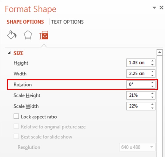
32. Play With Rotation to Create Dynamism
Rotating elements in your slide such as shapes create movements.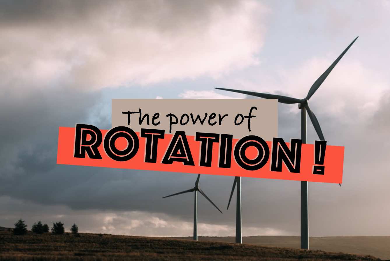
Here’s how you do it:
33. Use White Space
White space is basically the portion of your slide that’s left empty (meaning, blank).The point of using white space if to free up your slide of any disturbing element like text or image, and guide readers’ attention to specific elements.

34. Add Shadows to Your Visuals

Select your visual, click right, and “format object”.
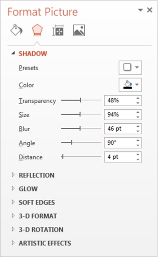
This works very well with visuals that have transparent backgrounds (click here to learn how to remove the background of a picture in Powerpoint).
What you can do here is create circle shapes and add your chosen icons in the center of each circle. If your circles have a light color, use black/dark icons. If they have a darker color, use white icons.
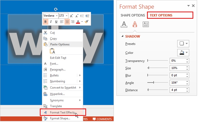
35. Integrate Text Effects
Adding shadow effects to your text is a great and easy way to convey information in a unique, creative way.Once you’ve typed your text, select the portion of the text you want to add effect on, click right, and select “format text effects”. Then tweak the shadow options until you get something you like.


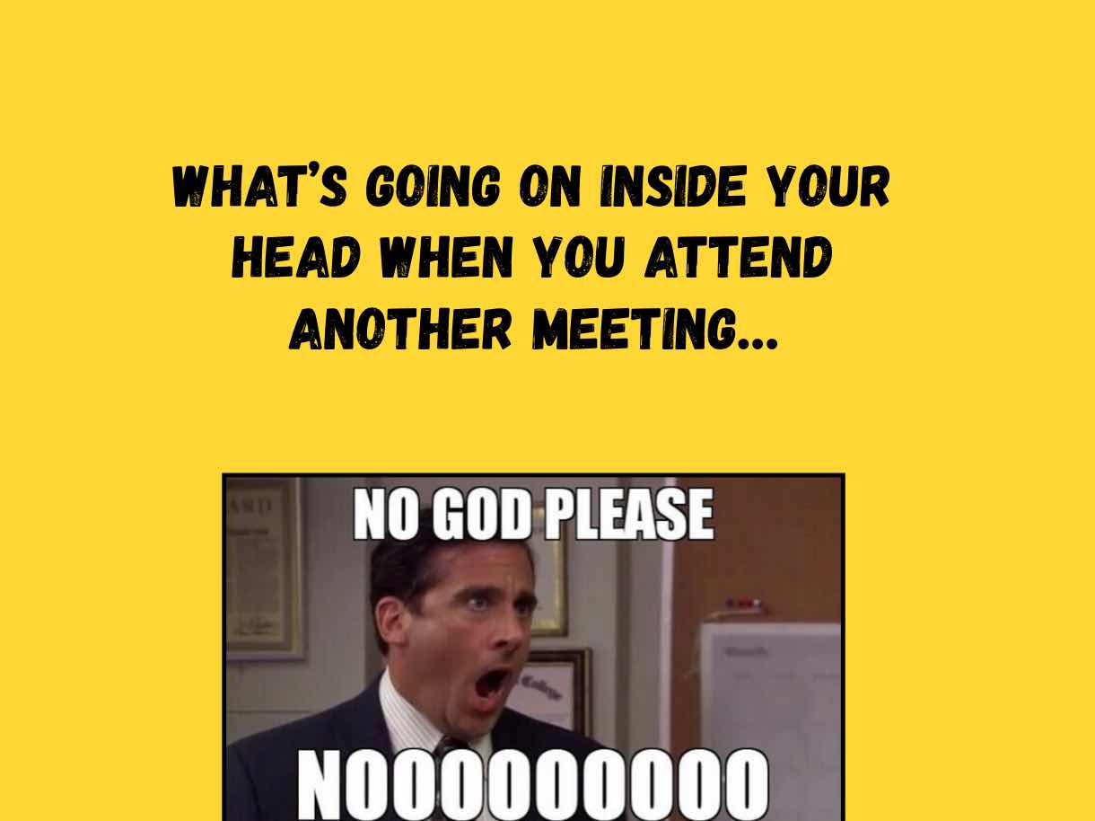
36. Add Memes
37. Use Emojis
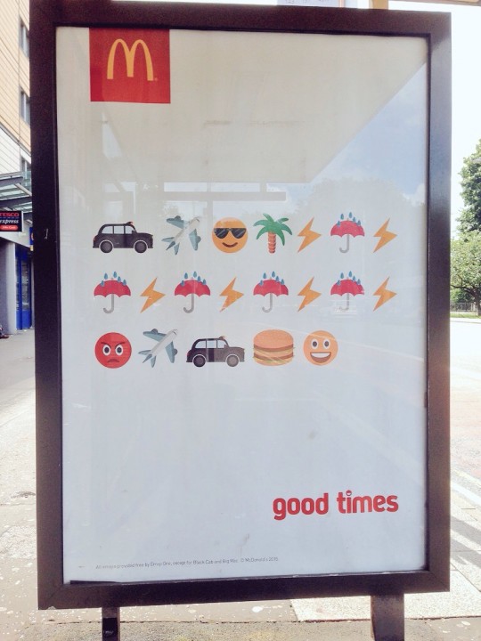
In a digital age with more technology-based communication, one language has been adapted to suit the modern world’s ever-changing means of relaying information […s] symbols called emoji (source).Emojis are bringing nuance that just isn’t possible with text alone. Just see this little story in McDonalds recent, brilliant advert below:
Integrate emojis in your slides is an effective (and creative) way to convey feelings while bringing freshness to your slide designs.
38. End with a Strong Closing Slide
Getting this slide done will be much easier if you did your homework in tip # 1 (define the goal of your presentation).If your slide’s target was solely to inform people, then you can close by wrapping up what they learnt , and put “thank you” or “questions?”.
If you’re looking for an approval or feedback, then asking a question is the best way to go.
For instance:
Sales pitch to prospects -> “is there any question we haven’t answered yet?”
Presenting a new project to your boss -> “ready to move forward?”
If you’re willing to get readers to do something, such as visiting your website or subscribing to your newsletter, then close with a specific call-to-action:

Source

Source
Mindsets & Strategies to Think Like a Designer
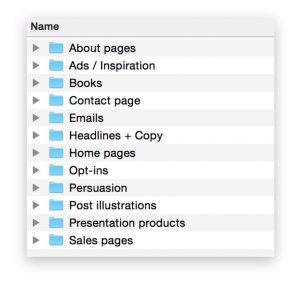
39. Steal Like an Artist
Create a folder on your desktop and title it “Swipe File”.
Anytime you see a beautiful presentation design online, just add it to your swipe file.
Set up individual folders or labels to organize your findings well and save time (E.g. “Great Cover Slides”, “Business Slides”, etc). Pretty soon, you’ll have a huge bucket of inspiration that you can tap into when working on your own presentations.
Here’s how my personal swipe file looks like:
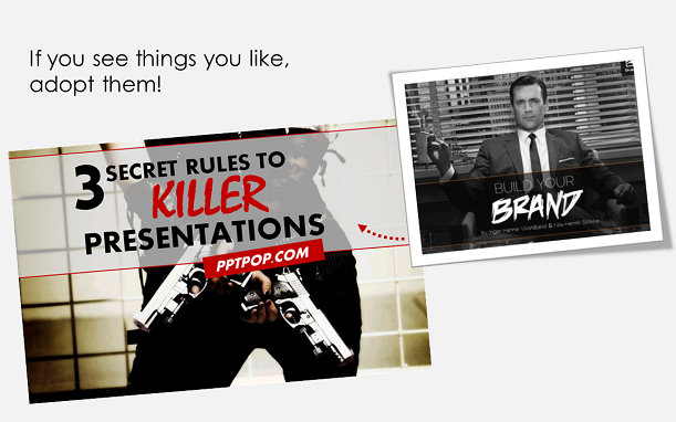
40. Reverse Engineer the Best Presentations
Our friend Google defines reverse engineering as “the reproduction of another manufacturer’s product following detailed examination of its construction or composition”
In the case of presentations, the point is basically to study amazing presentations that were designed by world-class designers. Follow the simple 3-step process I’ve outlined for you in this post, and apply it to your presentation.
The quick tutorial will help you design good PowerPoint slides, even if you’re not a designer and know nothing about design.
For instance:
41. Invest in Premium Presentation Templates
Know that feeling when you have to design that slick and professional presentation – for your boss, a high-stake client or even investors – but you have no time and budget to make it?
The thing is, these slide decks are key pieces for managing your business: sales meetings, marketing strategies, business plans, and so on.
But let’s be real, you’re not a designer (neither am I), and unless you have natural talent at crafting amazing business slides, it can be really tough to put together presentations that impress and deliver more than you promise.
What we need is a way to craft all these high-stake presentations easily, and fast.
Meet Marketofy, The Ultimate Multipurpose Template
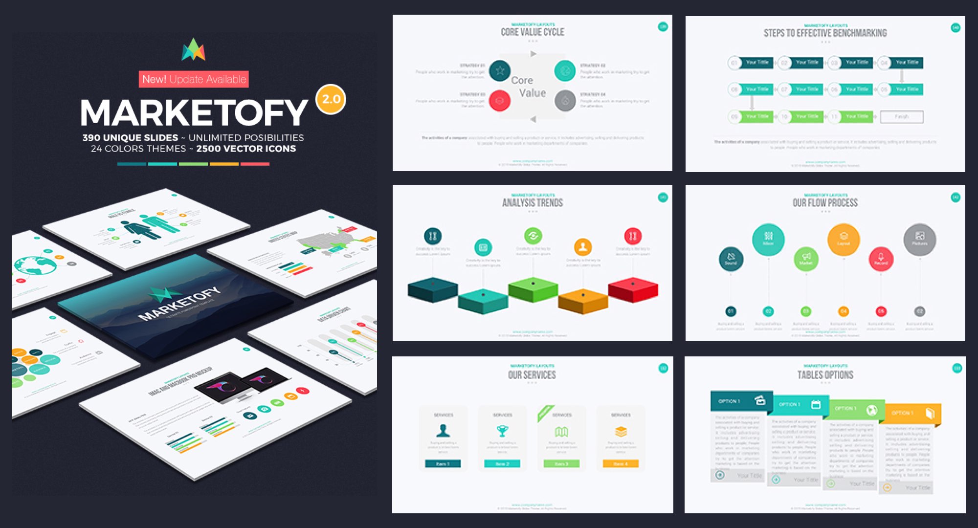
Pre-built, designer-made templates let you create beautiful presentations like a real pro (and no, it won’t take you months or crazy design fees).
That’s right:
You won’t need to spend your entire nights (or weekends) to design, edit, arrange, re-arrange, modify again and again your slides to finally put together a presentation that looks, well, it looks “just fine”.
Because everything you need – unique, easy-to-edit slides, beautiful icons, graphics and so much more, will be stored in one giant folder patiently seating on your computer’s desktop.
You’ll make slick, professional presentations AND save a huge amount of time because you’ll be able to create presentations using templates that are just waiting for you to turn them into powerful, top-tier business materials.
Here, have a look at some of these templates:
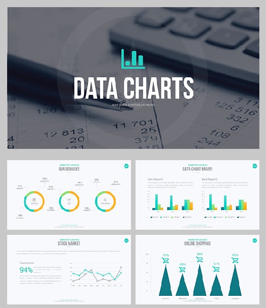
Clean and modern slides. Who said data charts had to be lame?
By now, you understand why presentation templates can help you create high value decks in a fraction of the time it takes others (Just imagine the look on your colleagues’ face when you start revealing your slides at the next meeting…)
And guess what, you can get these templates like Marketofy for the less than the price of a movie ticket (or a lobster roll, if you prefer). That’s basically less than $20 for…
- Hundreds of easy-to-edit slides for you all presentations
- 2,500+ vector icons (that means you can change colors and sizes without losing quality)
- Dozens of charts and graphs, maps. Fully-editable!
- Fast and free customer support 24/7
- And so much more!


